A small apparel display works hardest when its colors make the selection feel intentional before a shopper reads a single tag. Rather than squeezing in every shade, choose a compact story with a clear anchor, a supporting neutral, and one or two accents. The goal is not to make every piece match; it is to help each piece look like it belongs while still giving the eye somewhere to travel.
Start with one anchor, not a pile of favorites
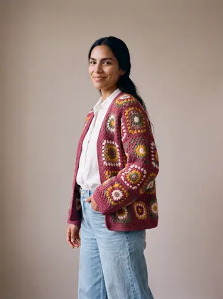
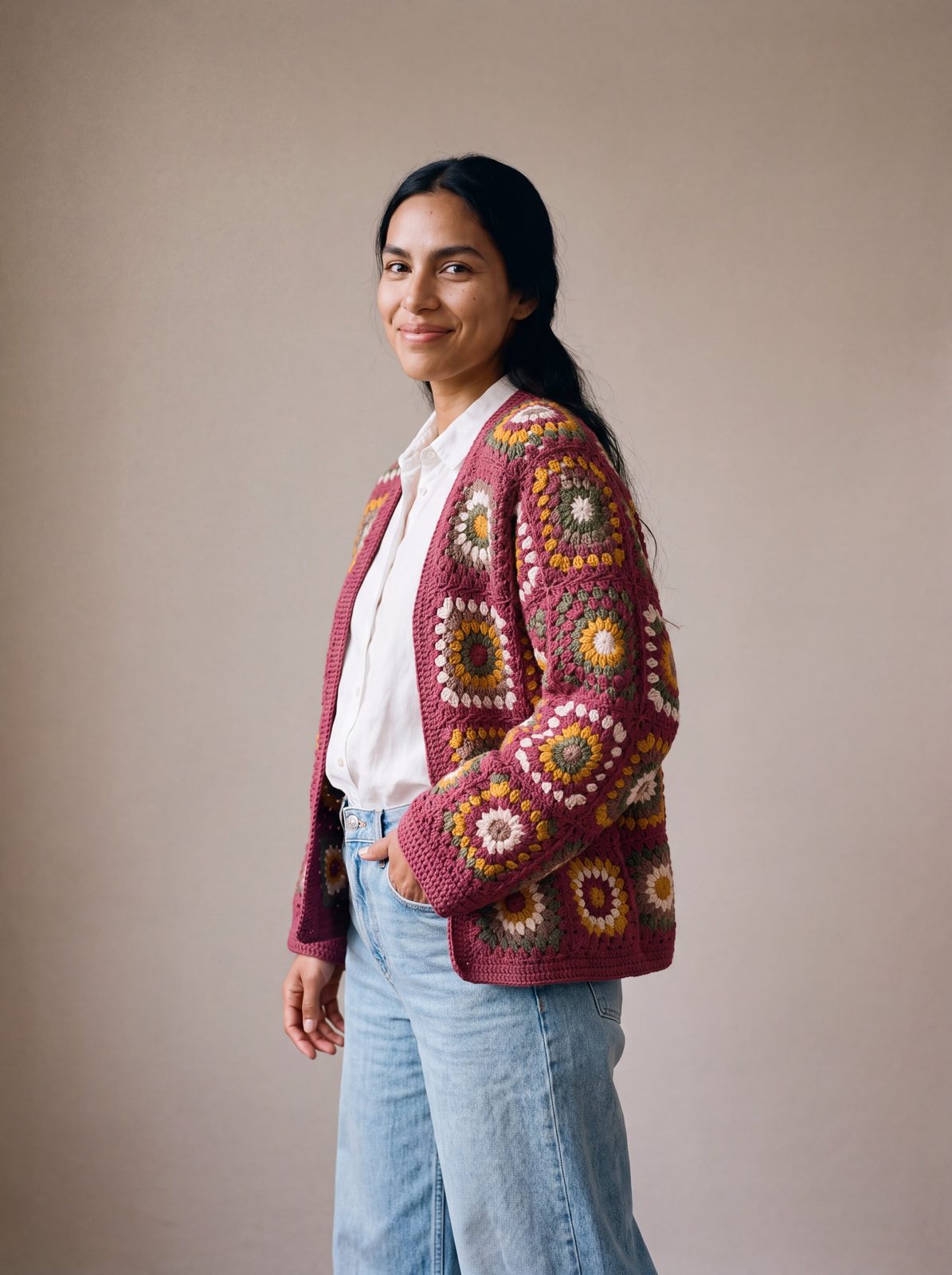
Pick the item with the strongest visual presence first. It might be a saturated knit, a printed top, or a distinctive silhouette whose colors are already doing the talking. Let that piece set the display’s direction, then build around colors it actually contains. For example, the Mosaic Cardigan in Burgundy & Mustard offers a deep frame, warm mustard, sage, taupe, and cream. That is already a usable palette: burgundy can anchor, cream can create breathing room, and mustard can appear as a measured accent elsewhere.
There is no need to repeat every color in every item. Instead, look for a shared note that can connect two or three pieces. A cream tee under a colorful cardigan can echo a light stitch; a muted green accessory can pick up a smaller detail without turning the whole arrangement into a matching set. When selecting an anchor, consider how it reads from a few steps away. If the pattern is busy, keep its neighbors quieter. If the piece is mostly one color, it can sit comfortably beside another item with more pattern.
Think in proportions as well as hues. A useful starting point is to let the anchor occupy roughly half the visual attention, reserve a substantial share for quieter colors, and use the brightest accents sparingly. A tiny fixture may need fewer colors than a wall rail, and a dark backdrop changes how bright pieces register. Stand back and notice what catches your eye first. If several things compete equally, edit before adding more.
Build a range of light and dark
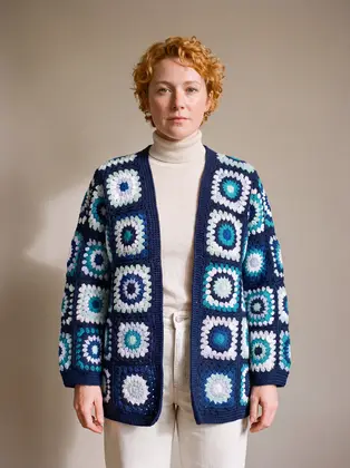
Color stories become easier to read when they include contrast in value, meaning how light or dark a color appears. A display made entirely of mid-tone shades can feel flat even when the hues differ. Pairing a deep navy or burgundy with cream, pale blue, or soft gray gives the eye a visual rest and makes texture more visible. The Long Cardigan in Navy & Turquoise pairs a dark ground with turquoise, mint, ice blue, and white. Its navy can ground lighter tops, while the cool colors offer a natural bridge to denim or other blue pieces.
Try arranging garments from light to dark, or use a dark item at each end to frame a lighter center. On a short rack, a clear progression is often easier to scan than a strict light-dark-light pattern. On a small table, place the darkest item toward the back and lighter folded pieces forward.
Contrast should not be mistaken for maximum brightness. A very pale neutral beside a saturated color may sharpen the whole display, while two equally strong colors can compete. If a bold piece already has several accents, repeat only one or two of them nearby. Keep other garments simpler in hue or print. This lets shoppers imagine outfits rather than decode a wall of unrelated color.
Use a temperature story to make the edit feel cohesive
Warm and cool colors each create a different mood, and mixing them works best when there is a reason. Warm combinations might begin with rust, mustard, burgundy, and cream; cooler ones might use navy, teal, aqua, and soft gray. These are not strict rules. A small note from the opposite family can bring energy: a warm cream or blush can soften a blue-led display, while navy can add definition to a cluster of earthy shades.
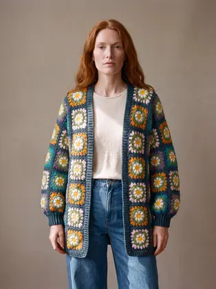
The teal Daisy Balloon Sleeve Long Cardigan is a useful example of a piece that contains both a deep base and lively details, including white, yellow, green, orange, lilac, turquoise, and blush. Rather than placing it among every bright item in the shop, choose one supporting color from its pattern and repeat that note in a neighboring piece. Keep the remaining companions calm. That way the cardigan remains the focal point without feeling isolated.
Color temperature can separate adjacent groups. Place a cool blue story on one end and a warm earth-toned story on the other, then use a neutral garment or visible gap as a transition. This prevents an abrupt division while preserving each group’s character.
Make pattern and texture part of the palette
Color does not work alone. Crochet, ribbing, smooth knits, woven surfaces, and prints all catch light differently, so a display can feel rich without adding another shade. When one piece has a strong motif, position it where the details are easy to see and let neighboring garments contribute shape or texture rather than another competing print. A solid item in a color already present in the motif can connect the pieces with less visual noise.
Group pieces by visual relationship, not simply by category. Two cardigans can sit together if their colors share a ground, while a top can bridge them through a repeated accent or neutral. Garments of the same type do not automatically belong in one story; separate clashing hues into distinct zones.
Pay attention to what happens when garments overlap. A dark sleeve laid across a pale garment can create a sharp block; a colorful edge peeking from beneath a neutral layer can make the palette feel considered. Keep the most distinctive pattern visible rather than burying it behind another hanger. On a very narrow rack, turn one feature piece slightly outward and keep the rest in a clear sequence, so the display reads as an invitation rather than a crowded inventory row.
Edit for the actual space and the shopper’s view
A palette that looks balanced on a planning sheet may not work under the fixture’s lighting. Check colors in the location where shoppers will see them, and look from the entrance as well as close up. Warm bulbs can make cream and yellow feel stronger; cool daylight can emphasize blue or gray. If the display sits against a colored wall, account for that background as another color in the story. A garment should not disappear into its setting.
Small spaces benefit from restraint. Choose a short list of colors and let spacing do some of the work. Leave enough room between a vivid patterned piece and its neighbor that the two do not merge into one block. If the fixture is shallow, present fewer folded items and keep the clearest color relationship at the front edge. If it is vertical, repeat one accent at more than one height to guide the eye upward without making every level identical.
Before finishing, remove one item and see whether the display becomes easier to understand. Then check that each garment can be reached and returned easily.
Keep the story useful beyond the fixture
A good color edit should suggest real outfits, not just an attractive arrangement. Include enough quiet pieces to show how a statement item might work in everyday dressing. A display that combines a distinctive cardigan with a neutral layer and a familiar bottom gives shoppers more than one way into the story. Use the shop’s cardigan collection or browse tops when choosing companion categories, and direct customers to size and care information when they need practical details. For product-specific sizing, materials, or care, defer to the garment’s actual label and confirmed store information.
Finally, treat the palette as a small, editable point of view rather than a permanent rule. When pieces change, keep the anchor if it still makes sense and replace only the supporting colors that no longer connect. That approach saves time and protects the display from becoming a random assortment. A compact color story succeeds when shoppers can understand it quickly, notice the individual garments, and picture how one piece might fit into what they already wear.